| Expand | ||
|---|---|---|
| ||
Welcome to the 12 Days of Confluence Elements! Each day you’ll learn how to use common elements we use in our Confluence instance. Along with the text you add to a page, elements are the building blocks that help you organize and present information in the way you want. What are elements?All the items that can be inserted onto a page are elements. Elements include panels, dividers, emojis, macros. We’ll learn more about macros soon. Adding an elementElements can be added by clicking the Insert menu from the toolbar, or from the slash command menu. In our instanceWe use elements such as panel, divider, emoji, expand, and heading, and macros. You can see examples of many of these elements at Graduation & Commencement. |
| Expand | ||||
|---|---|---|---|---|
| ||||
What are macros?A macro is a type of element that allows you to extend the capabilities of your Confluence pages, allowing you to add extra functionality or include dynamic content. For example, use the Attachments macro to list files attached to a page. Macros can also be used to create visual interest. Add a macro to your page To add a macro:
To edit a macro:
Macro parametersMany macros have optional parameters you can use to control the macro's output. With the Attachments Macro, for instance, you have two optional parameters allowing you to:
Macro placeholdersMacro placeholders are displayed in the editor where you have added a macro to the page. When editing a page, you can:
|
| Expand | |||||||||||||||||||||||||||||||
|---|---|---|---|---|---|---|---|---|---|---|---|---|---|---|---|---|---|---|---|---|---|---|---|---|---|---|---|---|---|---|---|
| |||||||||||||||||||||||||||||||
Use the Children Display macro to insert a list of a page’s child pages, and their descendants. People viewing the page will only see the links for pages they have permission to view. By default, the list will show the child pages of the page the macro is on — but you can also select a different parent page when configuring the parameters. The macro can display the child and descendant pages of whatever parent page is specified. When would you use Children Display macro?This is useful, for example, if you want to create navigation links on a parent page to its nested pages. Where is this used in our instance?You can find Children Display macros on section landing pages such as Graduation & Commencement under “In this section”.  Add the Children Display macroTo insert a macro:
To edit a macro:
The page links are dynamic — if additional child pages are published or the page titles are edited, those changes will automatically be reflected in the list. Configure the parametersParameters are options that you can set to control what and how content from the macro appears on the page. If the parameter name used in Confluence Cloud storage format or wikimarkup is different than the label used when inserting macros using the browser or the slash command, it will be listed below in brackets (
|
| Expand | |||||||||||||||||||||||||||||||||||||||||||||||||||||||||||||
|---|---|---|---|---|---|---|---|---|---|---|---|---|---|---|---|---|---|---|---|---|---|---|---|---|---|---|---|---|---|---|---|---|---|---|---|---|---|---|---|---|---|---|---|---|---|---|---|---|---|---|---|---|---|---|---|---|---|---|---|---|---|
| |||||||||||||||||||||||||||||||||||||||||||||||||||||||||||||
The Content by Label macro is used to display lists of pages, blog posts or attachments that have particular labels. When would you use Content by Label macro?It's great for collecting related pages together and filtering out content that you don't want to see. For example, you could use this macro to display a list of all pages that have the label 'feature-shipped' and include the word 'Blueprint', or to list any pages with the label 'meeting-notes' that you've been mentioned in. Here's how the macro looks on your page:  Where is this used in our instance?Many articles include the Content by Label macro to drive users to related content. Our configuration ranges from displaying all content with a selected label to displaying only 5 articles with a link to additional related content. You can see it in action on Graduation & Commencement, and this macro can be used on any page where it makes sense to provide additional related content.  Use the Content by Label macroTo add the Content by Label macro:
To edit the Content by Label macro:
CQL filtersCQL (Confluence Query Language) is a query language developed for Confluence, which you can use in some macros and the Confluence search. Confluence search and CQL-powered macros allow you to add filters to build up a search query, adding as many filters as you need to narrow down the search results. To add a filter to your query, select the Add a filter link. You can use the following CQL filters:
AND, OR, and NOT operators
Put simply, OR values are entered in the same filter, AND values are entered in different filter.
** You can add these filters in CQL-powered macros but in search they're part of the standard search filters, so they don't appear in the Add a filter menu.
Macro display optionsThese options control how the macro appears on your page.
|
| Expand | ||||||||||||||||||||||||||||||||||||||||||||||
|---|---|---|---|---|---|---|---|---|---|---|---|---|---|---|---|---|---|---|---|---|---|---|---|---|---|---|---|---|---|---|---|---|---|---|---|---|---|---|---|---|---|---|---|---|---|---|
| ||||||||||||||||||||||||||||||||||||||||||||||
The Table of Contents macro scans the headings on the current Confluence page to create a table of contents based on those headings.
When would you use Table of Contents macro?This helps readers find their way around lengthy pages, by summarizing the content structure, and by providing links to headings. A rule of thumb is to use the Table of Contents macro when your article requires scrolling past the “fold” of a page. Users generally familiar with the page may be looking for a specific section, and the Table of Contents macro can help them navigate to the specific content they’re looking for. Where is this used in our instance?An example of the Table of Contents macro is found on Viewing and maintaining a student's academic standing (SHAINST/SGASTDN). Rather than using a formatted heading for “On this page”, we use bolded Normal text to prevent the heading from pulling into the macro.  Use the Table of Contents macroTo add a Table of Contents to your page:
To configure your Table of Contents:
ParametersParameters are options that you can configure to control exactly how your table of contents appears on the page. To customize your table of contents, you can configure its basic and/or advanced parameters, depending on your needs and preference. Basic parameters
Advanced parameters
|
| Expand | ||
|---|---|---|
| ||
Create a collapsed section that reveals more information for the people who seek it. This is a useful formatting element when the amount of info on a page is overwhelming at first glance. Using the expand element accommodates different learners by hiding images/content for those who just need a nudge but keeping them accessible for novices. Type You can see an example of how we use the expand element at Graduation & Commencement.  |
| Expand | ||
|---|---|---|
| ||
Format text to represent the hierarchy of information on a page. Once headings are created, you’ll be able to use the Table of Contents Macro to generate a list of links pointing to the headings on the page. The list of links appears wherever you add the macro, and it automatically updates each time someone changes the wording of a heading or the heading level. We’ll be learning about macros starting tomorrow. You can also link to specific content on a page by clicking on the link icon next to a heading.  Type |
| Expand | ||
|---|---|---|
| ||
Emphasize information by choosing a preset panel type to consistently communicate ideas like info, note, error, success, and warning. The preset types include an emoji and a background color. In addition to the five preset panel options, you can customize panels by choosing one of the 20 background colors available. Panels can have emojis, or you can remove the emoji to meet the needs of your content. The emojis available to you are the same set that you already use in Confluence; this includes custom emojis you and your teammates have added. Type  You can see an example of how we’ve used panels to create visual interest on an FAQ page and how we’ve integrated panels with headings on Responding to students' registration questions |
| Expand | ||
|---|---|---|
| ||
Create and insert linksAdding internal or external links can guide your reader to additional relevant content. Highlight words or phrases then use Cmd + K for Mac or Ctrl + Z for Windowsto convert them into links. You may also select the link icon from the top menu. Link to headings or sectionsTo insert a link leading to a specific heading or section of a page:
Link to attachmentsYou can also create links to attachments you’ve already added to your page. To link to a page’s attachment:
To link to the latest version of an attachment on another page:
Display optionsOnce you type in or paste a link when editing a Confluence page, you can choose how it appears after you publish. To change the Smart Link display:
Inline viewInstead of a URL, inline view shows only the title of the link. This is useful when you want to insert multiple links in a table.  Card viewCard view offers more context by showing metadata like project details and summary. When your readers hover over Smart Links displayed in card view, they can interact with link elements or preview the content. Select Open preview to view the link at near page-width without leaving the page. Embed viewEmbed view allows you to view pages, boards, lists, timelines, or calendars in other products without having to leave the page. Watch a video from YouTube, read and edit documents, leave comments in your design files and more, all within your current page.  |


| Expand | ||
|---|---|---|
| ||
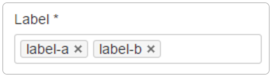
Labels are key words that you can add to pages and attachments to make them easier to group and find. Labels allow you to easily see, display, and search for related pages. For example, you could add the Add labels to a pageAnyone with permission to edit a page can add labels to it. You can add labels to a page while you're editing it or after it's published, when you're viewing the page. When you’re viewing a pageTo add a label to a page you’re viewing:
When you're editing a page
Add labels to attachmentsTo add labels to an attachment:
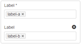
Search for labeled contentYou can find a list of all labels in our Business Process Library, which links to labeled content, in our Index. Remove labelsWhen you're viewing a page, you can remove labels by selecting the to the right of the label. Labels appear on the bottom right of the page, above page comments.  To delete a label across a site, you'll need to remove it from all the pages and attachments it appears on. |
| Expand | ||
|---|---|---|
| ||
Add an image, video, GIF, or file to a Confluence page by selecting the Add image, video, or file button. You can upload the media from your computer or display an image from another web page using its URL. You can also drag and drop files, such as images, multimedia, Office files, and PDFs, from your computer directly into the editor. Resizing images and videosYou can resize images and videos by dragging the handles on their sides. Media will proportionally grow or shrink based on how much you drag the mouse in and out.  GuidesGuides appear to help size and align your media width with other media on the page.  Image and video settingsWhen you select an uploaded image or video, a floating toolbar appears. You can use this toolbar to:
File display settingsWhen you insert a file into a page, it will appear as an inline tile or a thumbnail. You can use the floating toolbar to control the following: 
|
| Expand | ||||||
|---|---|---|---|---|---|---|
| ||||||
TablesTo add a table, select Table in the toolbar. A three-column, three-row table (including a header row) will appear on the page. 
When viewing a table on a page, you can sort the content by selecting the sort icons in the header row. Your sorting choices don’t impact what other people see and are not saved.
Resize a tableTo resize a table:
The columns in the table will proportionally grow or shrink to fit the new width of the table.  Edit a tableTable editing tools are contextual and vary based on where you place your focus. Select an entire table by placing focus in the top left. This can be useful if you want to copy and paste the whole table somewhere else.  Table optionsWhen you're editing a page and have selected some portion of the table, table options will appear. Use table options to:
 In a cell (or when selecting multiple cells, rows, or columns), select the down arrow to access the following actions:
You can see an example of a table in our Personnel list. |
| Expand | ||
|---|---|---|
| ||
The layout of your pages can have a big influence on how they're read You can create different layouts in Confluence after inserting a default layout using the Layouts tool, giving different parts of your page a different column configuration.  There are several column layouts available. After inserting a layout, you can easily switch between the options. Content doesn't get lost when you change the column layout; additional columns are added to the right, and when you change to a layout with fewer columns, the content moves to the left. This replaces the add, remove, and move section functionality of the legacy editor. Layouts can be moved from the page by selecting the trash can icon in the floating toolbar.  Our most commonly used layout is the right sidebar layout, which can be seen in the Banner Guide. |
Other ideas
Managing mirrored content - Save time by reusing content
Standardize content with page templates - Use page templates
Review the history of a page - View page history
Managing draft content - Draft your work
Help users find new content with Live Search - Insert the Live Search macro